Some work around mapping the spatial and temporal formations of data centers.
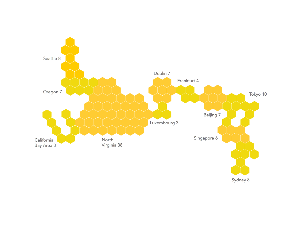
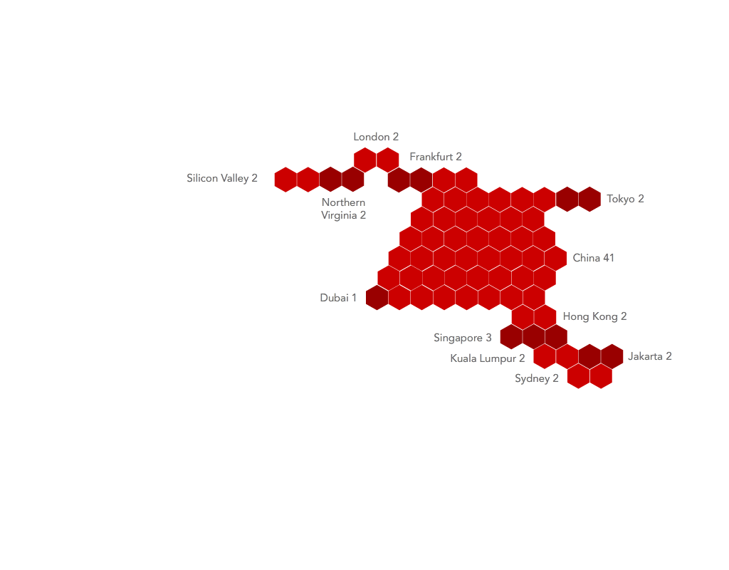
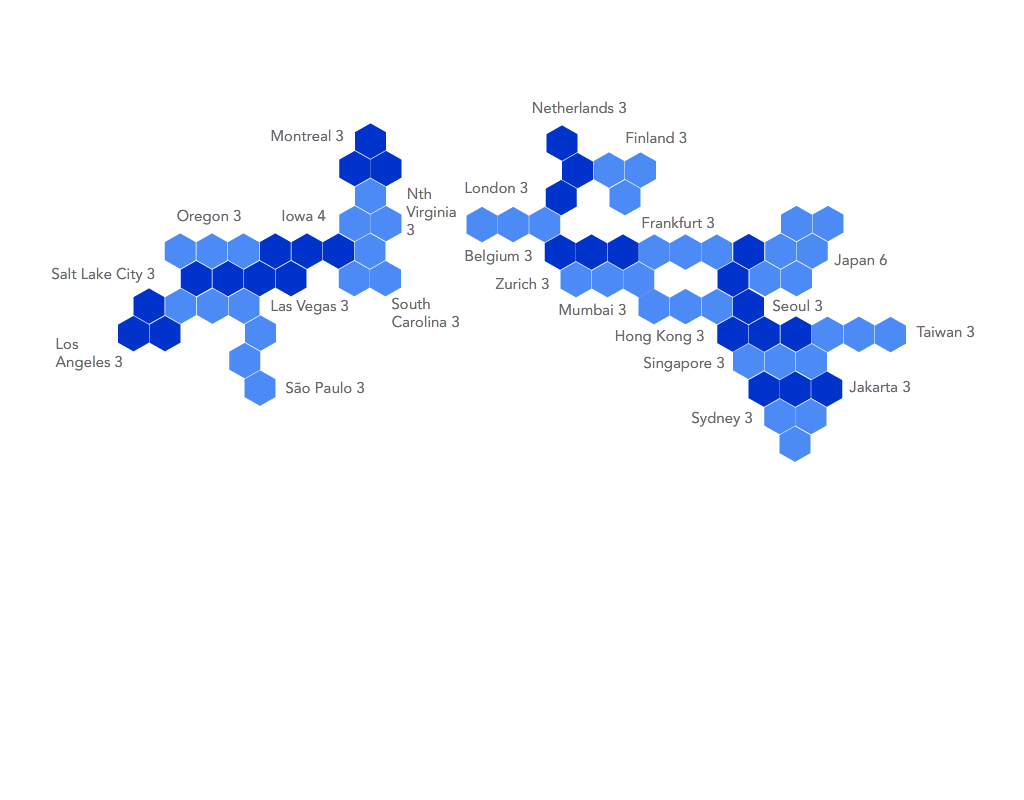
The first series of images is based on a cartogram logic, where each data center is represented by a hexagonal tile. For instance, there are 8 Amazon Web Services Data Centers in Seattle, forming a zone with 8 tiles.
Geographic locations are maintained in these images, placing Seattle at the upper left and Tokyo at the upper right. But each image also collapses empty space between cities and data center clusters, allowing Dublin and Frankfurt, for instance, to sit alongside each other.
These images, while unorthodox in approach, allow for some immediate insights when comparing these data center “worlds.” Alibaba, for instance, clearly has a focus on China and the broader east Asian region, while AWS has far more centers in the United States and the West. There are also more subtle differences, such as the fact that AWS has high numbers of data centers in fewer zones, while Google has more locations yet fewer data centers in each one.
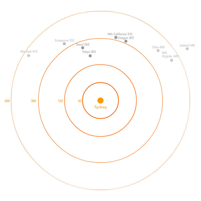
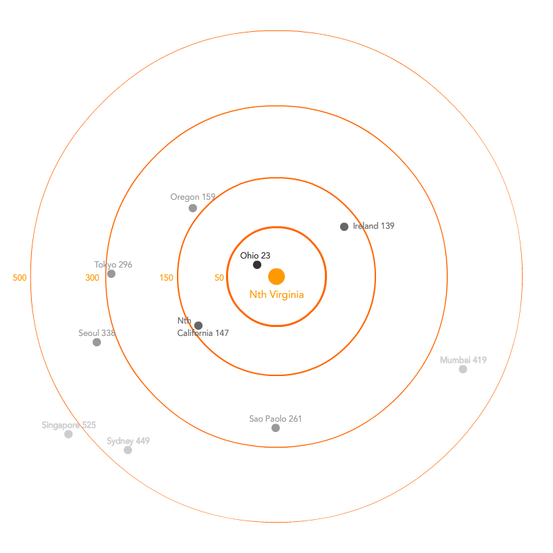
The second series is an attempt to diagram the “temporal territories” of data centers. The first two images are based on ping times between AWS zones – the length of time taken to send a small packet of information from an AWS data center in Sydney, for example, to one in Tokyo. Granted, pings are subject to a number of variables such as local network conditions, time of day, and so on. Nevertheless, these diagrams provide a portrait of what kind of information infrastructure is “temporally proximate” to others. For instance, we see the degree to which Sydney is “temporally isolated” in comparison to AWS’s North Virginia hub, which has numerous data center clusters less than 150 milliseconds away.
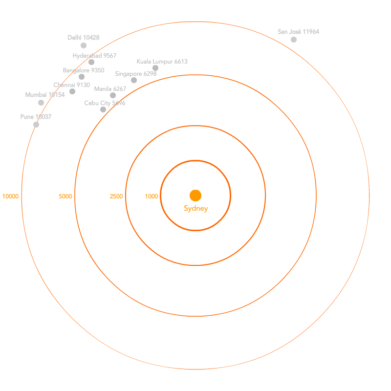
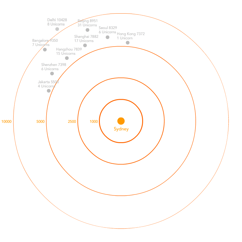
These diagrams are extended, using Sydney, as an example. However instead of using ping times, they revert to a more traditional distance based measurement using kilometers.
The first, “Unicorn Territory,” draws on a recent CBRE report showing number of Unicorns in the Asia Pacific and where they are located. Beijing is clearly the epicenter here with 31 Unicorns that are hosted in the city, while nearby Shanghai and Hangzhou also boast high numbers.
The Supercity Territory version draws on the Tholons index, which scores cities based on “competitiveness” in digital services. This seems to be shorthand for a mix of educated but inexpensive labour, a pro-business climate, adequate infrastructure, and other factors which render these cities optimal places for corporate outsourcing of software engineering, customer service, or other information services. Delhi, Bangalore, and Chennai all score highly in this regard.